
Disclosure: As an Amazon associate, I may earn from qualifying purchases
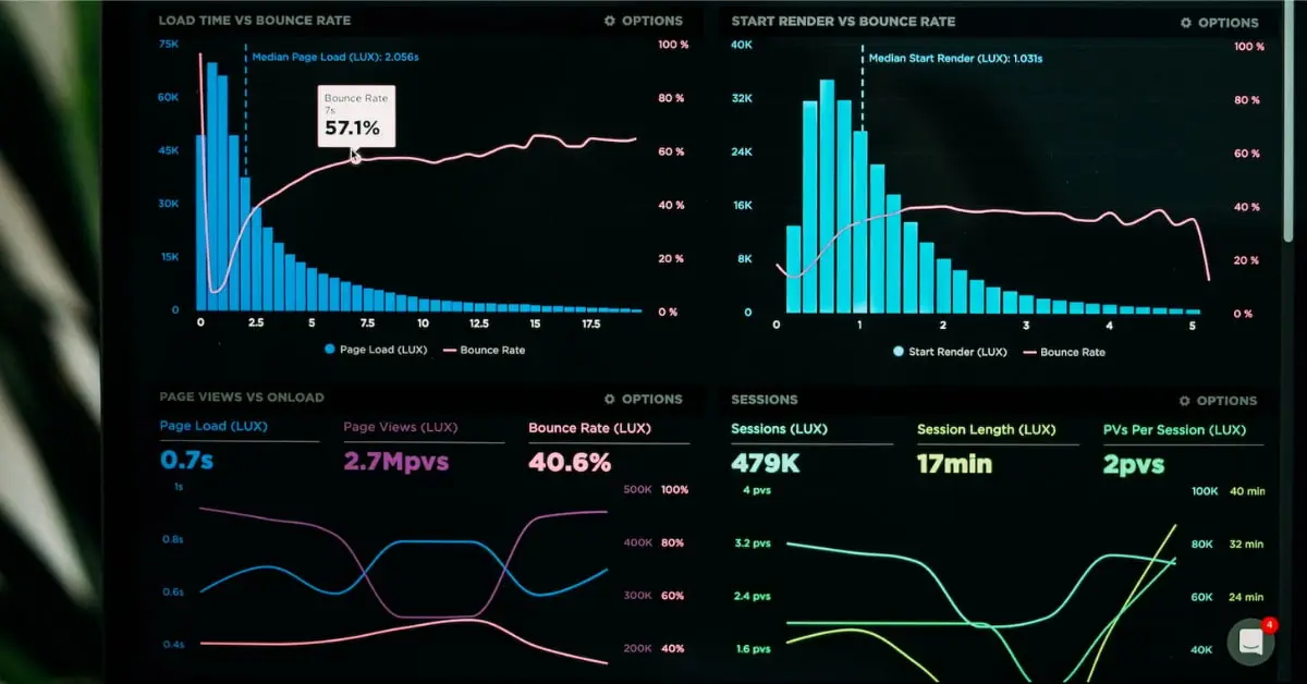
The need to make sense of increasingly large and more complicated datasets gave rise to the idea of data visualisation in data science. It became obvious that conventional methods of data analysis were ineffective as the amount of data being generated increased exponentially.
It was not enough to merely glance through spreadsheets and tables of numbers to properly comprehend the patterns and trends concealed inside the data.
In order to make data easier to understand and analyse, data visualization allowed analysts to display data in a graphical style utilising charts, graphs, and other illustrating elements.
The ability to immediately spot patterns, trends, and discrepancies that might have been challenging to spot in conventional formats was made feasible by the presentation of data in a visual format.
And this is done after the data has been cleaned and preprocessed in order to transform raw data into informative insights – the details of which you can check out here.
The whole process is now an indispensable aspect of data science, that has allowed analysts and scientists to form make better-informed decisions based on insights derived from data.
Today, such technologies are utilized in practically every business and area – from banking and healthcare, to marketing and advertising. All the while, helping organizations to extract maximum value from their data.
Introduction to Data Visualization with R
Making visual representations of data in order to communicate insights and patterns that might not be immediately obvious in raw data is known as data visualisation. It is a crucial component of data science because it enables data analysts and scientists to present their findings to a broad audience, including those who might not have an expertise in technical fields.
There are many different ways to visualise data, such as bar charts, line graphs, scatter plots, heat maps, and more.
By representing data in a visual manner, it becomes easier to discover patterns and trends, identify outliers, and communicate complex relationships between variables.
The value of data visualisation in data science is found in its capacity to make difficult data accessible to a wider audience. While unstructured data can be challenging to comprehend for non-technical people, a well-designed visualisation can help people understand crucial insights and successfully explain findings.
Identifying patterns and trends that may not be immediately obvious in raw data can also be aided by effective data visualization.
Data can be represented in a number of forms to uncover correlations between variables that might otherwise go undetected. A scatter plot, for instance, can show a correlation between two variables that might not be evident from a table of raw data.
Data outliers, anomalies, and errors can all be found via this process. When data is visualized, it is easier to discover values that fall outside of the predicted range, which can aid in detecting mistakes in data collection and analysis.
In essence, this step is a critical part in data science because it enables the dissemination of insights and patterns to a broad audience.
By presenting data visually, flaws or anomalies in the data can be more easily detected by spotting trends, correlations, and outliers.
Using ggplot2 to Create Visualizations
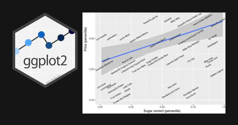
ggplot2 is a powerful data visualisation package in R that is widely used in data science. It offers a versatile and useful syntax for producing a range of visualizations, such as scatter plots, bar charts, line graphs, and more.
The ggplot2 package employs a layered grammar of graphics, meaning that visualisations are built from a number of layers, each of which represents a distinct part of the plot, such as the data, aesthetics, and annotations.
This approach allows for a significant degree of customization and flexibility when building representations.
The library() method must be used to load the package before using ggplot2. The data that will be used in the visualization and the variables that will be mapped to the aesthetics of the plot are then specified using the ggplot() method.
For example, to create a scatter plot using ggplot2, we can use the following code:
					scss
library(ggplot2)
ggplot(data = iris, aes(x = Sepal.Length, y = Sepal.Width)) +
  geom_point()
This code specifies the iris dataset as the data source and maps the ‘Sepal.Length’ variable to the x-axis and the ‘Sepal.Width’ variable to the y-axis. The geom_point() function is used to specify the type of plot, in this case, a scatter plot.
ggplot2 provides many different types of geoms, such as geom_bar() for creating bar charts, geom_line() for creating line charts, and geom_histogram() for creating histograms.
Additionally, the package provides many options for customizing the appearance of the plot, including changing the colors, fonts, and labels.
In summary, ggplot2 is a strong and adaptable tool for developing a range of visualizations in R.
Data scientists and analysts that need to convey complicated data in an intelligible and effective manner frequently use it because of its layered approach to graphics and extensive customization options.
Customizing Plots with themes, scales, and facets
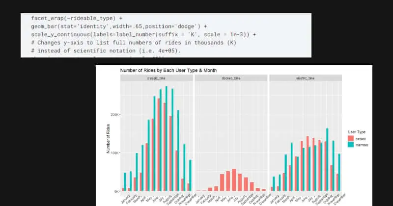
Customizing plots is a valuable data science operation that can make data depictions more engaging and successful at communicating findings. Themes, scales, and facets are just a few of the capabilities that the ggplot2 tool in R offers for designing plots.
Themes in ggplot2 are collections of predefined settings that can be used to alter a plot’s general appearance.
To make a plot with a white backdrop, for instance, use the theme_bw() method. To produce a plot with a dark background, use the theme_dark() function. The font family, font size, and colour scheme can all be altered to further modify the look of a theme.
The mapping between data and aesthetics in a plot can be managed using scales in ggplot2.
For instance, the scale_y_continuous() and scale_color_manual() functions can be used to alter the range of values displayed on a plot’s y-axis and the plot’s colours, respectively.
Scales can be used to modify a plot’s look in order to draw attention to important details or make it simpler to compare various data points.
Multiple plots can be constructed using ggplot2’s facets, each of which displays a distinct subset of the data. This can help in identifying relationships between variables that are tough to see in a single plot.
For example, the facet_grid() method can be used to build a grid of plots, each presenting a distinct combination of variables.
Custom plots that effectively convey insights from complicated data can be formed by combining themes, scales, and aspects.
For instance, a plot can be altered to emphasize the most significant features of the data while still offering more details through facets or custom scales.
What comes after?
After identifying patterns and trends present in the data, after visualizing them – comes one of the most fundamental steps in data science, and that is statistical analysis.
This not only aids in developing hypotheses from the given data, but also guides decision-making by making use of the best statistical techniques needed for our studies.
Techniques such as regression analysis, hypothesis testing, or cluster analysis, among others – help data scientists to test their hypotheses and draw conclusions once they have a detailed grasp of the patterns present in the data.
It is important to note that specific statistical techniques employed will depend on the nature of data being used and the research questions being posted.
That said, if one has a solid understanding of statistical theory and methodology, then the analyses will more often than not prove to be accurate and reliable.